Final Website Screenshot:

Final Website Link:
http://mywebspace.quinnipiac.edu/jkwahl/typography/imagesvstext.html
Articles:
Imagery & Text:
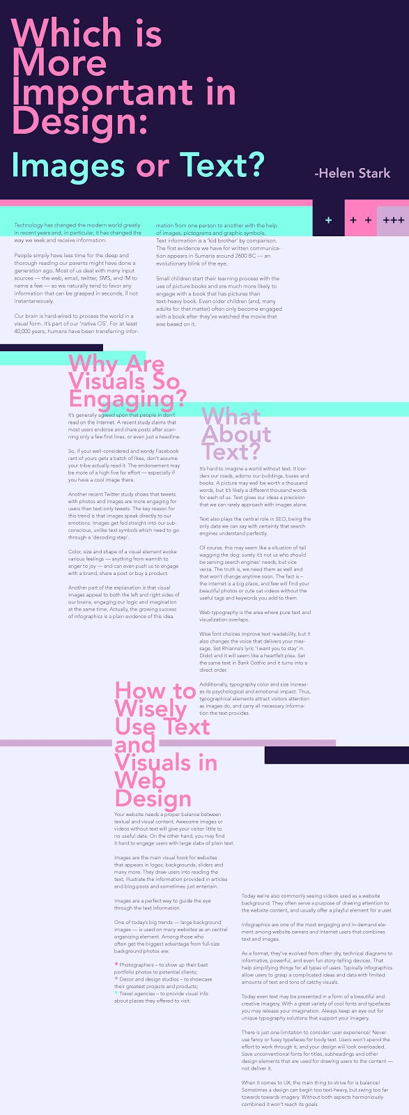
Which is More Important in Design: Images or Text?
http://www.sitepoint.com/images-text-important/
Typographic History:
A Brief Historical Overview of Trends
http://inspiredm.com/typography-history/
Hand-drawn Type:
The Golden Age of Hand Lettering in American Advertising
http://web.monroecc.edu/manila/webfiles/mcrum/4HandletteringShinn.pdf
Process Book:
-type studies
-color studies


Comps:
Comp 1:
Even though I decided not to go with this comp, I really enjoyed designing it. I rarely use only grayscale, so this one was more outside of what I normally do. The only problem with gray however is it can become somewhat dull. For this though, I felt it came across more as classy, but still could use a little something more going for it.
During critique, I was a little disappointed that the group that critiqued my comps only decided to focus on one of them, and that this one never had another set of eyes to assess it really. Even if I also was leaning towards my second one, I maybe would want to do something like this comp again in the future for perhaps a project that would suit the style better and wish I had some feedback on this one as well.

Comp 2:
For this comp, I thought it would be fun to break a couple of rules. Yes, I’m aware there isn’t a definite grid and yes, I also know the letting is pretty tight on the headlines. I really wanted to make the page a layout as visually interesting as possible without sacrificing too much readability. The colors I chose are pretty bright, but I feel like the dark blue really neutralizes any excessive discomfort on the eyes. Instead, the bright colors help make it easier to read and follow the tight leading and loose grid. For the body text however, I didn’t want to mess around with and made sure that part was the most readable because it is of course, the most important.
As for critique notes, this was the one that the group who had me to critique focused on. I really feel like I didn’t get too much out of the critique because they mostly zeroed in on things I already was aware of and purposely played with. The bulk of their critique was telling me to fix the headline leading and enforce a grid system when it was done with a purpose and not lack of observing typographic rules.
Basically not much changed from my comp to actual website except that I decided to switch from Avenir to Helvetica.
