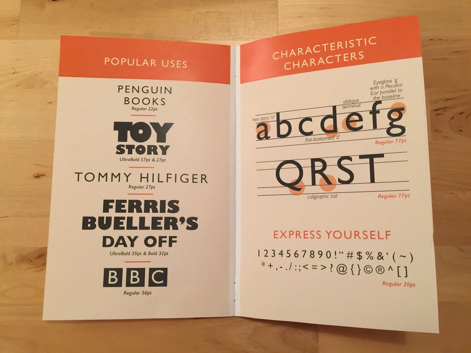
The guidelines for this project was to create a type specimen booklet that would showcase the typeface's assets in a visually pleasing way. The challenge of course is focusing solely on presenting the type in and interesting way as well as enticing potential clients.
Final Booklet:


Process Book:
-color studies
-type studies


Process Notes:
What size paper will you use?
Probably a smaller size to make a little handheld booklet. Also want it to be an irregular size, maybe 5x8.
How many spreads will fit on a sheet?
Just one on a normal 8.5x11 sheet of paper.
How will you bind your book?
Regular saddle stitched to keep it nice and clean.
What sort of budgetary limits have you put on the project?
Since I wish to keep it traditional like a book, I’m not looking to use any different materials so I shouldn’t have to worry much except for just normal printing costs.
How will your printing plans impact your project timeline?
Since the Staples store in Hamden is usually incredibly packed, I’ll probably need to research a few days in advance if they will be able to handle the job or if I should look at another location.
Update: I ended up going to a different Staples in Wallingford and they were able to print on the spot and were incredibly nice and helpful.
Update: I ended up going to a different Staples in Wallingford and they were able to print on the spot and were incredibly nice and helpful.
How does this piece fill a hole in your portfolio?
I have a lot of pieces with blue that are textured or have a photograph background. This booklet not only strays from being a normal poster like the many I have, but it also uses a color (orange), that I don’t use much of in a solid color. I also needed more work focusing on just my type work and I think this will fill that gap.
Comps and Testing of Assembly:
For the most part, I really like the way these comps came out. I think the sizes I picked all will work well when it comes time to print. The first one however is definitely my favorite. Even though originally in my sketching phase I was leaning towards the second purple one, I found in execution that the orange one was just far more visually interesting and the orange color is certainly one my portfolio is lacking.
I also really tried to incorporate that geometric pattern into my comps, but despite how hard I tried to make it work in the second one, something just looked off. The orange one is far simpler with the shapes and just comes across as cleaner and more professional. I also just had a lot of fun playing around with the classic Penguin Books look.

